General General 4 min read

True gems

I Will Always Love You, Purple Rain & more hits that almost didn't happen

Image: Alexas_Fotos

We all have those unforgettable songs that take us back to special moments in our lives. But some of those iconic hits almost never made it out into the world. Remember the theme song from The Bodyguard ? Believe it or not, it was almost replaced! Today, we're looking back at 10 legendary songs that, for one reason or another, were nearly never released. Let's hit play and enjoy!

1
"I Will Always Love You" by Whitney Houston

Image: Ransford Quaye

This legendary ballad was originally written and recorded by Dolly Parton in 1973. When the song was selected for the The Bodyguard soundtrack , the producers were initially hesitant. They were about to choose a different song for Whitney Houston, but everything changed in a second. Once they heard her sing it, they knew they couldn't pass it up. Today, it's considered one of her most iconic performances!

2
"Purple Rain" by Prince
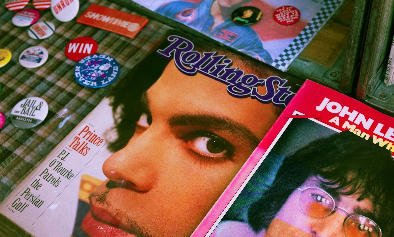
Image: Doyoun Seo

While we can't imagine a world without the iconic "Purple Rain," it almost wasn't released! At first, Prince conceived the song as a duet with Fleetwood Mac's Stevie Nicks, but she turned it down, saying the piece felt too overwhelming. Prince then trimmed the original version (the final still runs over 8 minutes) as the theme was considered too complex and extensive. Fortunately, after those arrangements, it was released on the album of the same name in 1984 and became one of his most legendary works.

3
"Billie Jean" by Michael Jackson

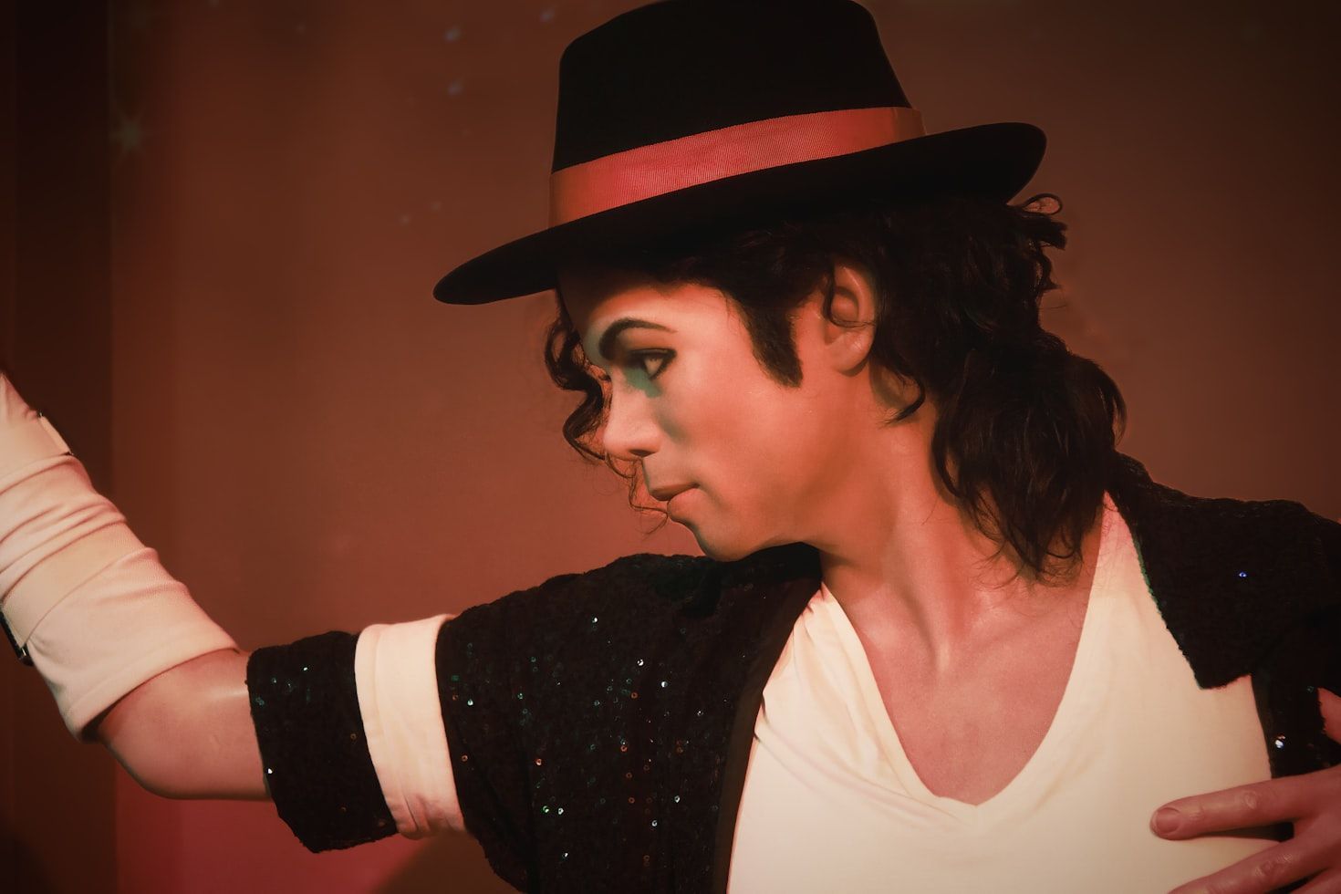
Image: Mathew Browne

The Thriller album wouldn’t be the same without the incomparable "Billie Jean"! But did you know that it almost didn't make the cut? Believe it or not, the album's producer didn't like the song and thought the title might confuse people, especially due to its similarity to tennis player Billie Jean King's name. He even suggested changing not just the title, but also the iconic bass intro. Fortunately, Jackson stood his ground, and the song became a turning point in his career!

4
"Nothing Else Matters" by Metallica

Image: Yurii Stupen

Metallica gave us the incredible ballad "Nothing Else Matters," later covered by multiple artists and bands around the world. But vocalist James Hetfield almost deprived us of this beautiful work! As he tells it, he composed the ballad on the road while missing his home and family. However, when his spirits lifted, Hetfield worried that the song might be too personal, and perhaps too soft for Metallica's heavy metal vibe. Fortunately, when the band members heard it, they loved it and convinced him to include it on The Black Album .

5
"Livin' on a Prayer" by Bon Jovi

Image: andre mosele

Who hasn't sung " Whoaaaa, we're halfway there, whoa-ooooh, livin' on a prayer " at the top of their lungs? We certainly have! But, strangely enough, Jon Bon Jovi almost kept this anthem a secret . When he first heard the full version of the song, he wasn’t convinced—he thought it was too simplistic and might not resonate with fans. Thankfully, his bandmates saw something special in it and convinced him to give it a chance.

6
"Smells Like Teen Spirit" by Nirvana

Image: Jurian Kersten

The legendary Kurt Cobain wrote "Smells Like Teen Spirit" as a protest against the polished pop hits dominating the music scene—but the result didn’t convince him. He was worried that the song would become too mainstream, given its commercial appeal. After some debate, the producer and the band convinced him to record it. To this day, it's one of the band's most iconic tracks and a defining anthem of the entire grunge movement!

7
"Like a Prayer" by Madonna

Image: Jonathan J. Castellon

"Like a Prayer" by Madonna is one of the most famous hits in pop music history. But the religious imagery in both the song and its music video raised concerns among her producers and record label executives, who feared an intense backlash that could affect the singer's career. Although it’s said that Madonna herself was initially hesitant as well, the song was not only released but also became one of her defining anthems.

8
"Sweet Child O’ Mine" by Guns N’ Roses

Image: Simon Weisser

Although it may be hard to believe, a record company once considered "Sweet Child O' Mine" unrepresentative of Guns N’ Roses’ sound. In fact, it’s said that Slash’s now-iconic guitar riff started out as an ironic joke! When the rest of the band heard it and wanted to build a song around it, he flatly refused. Luckily for the fans, the song did come out, and it also became the band's only number-one hit on the US Billboard Hot 100!

9
"1979" by The Smashing Pumpkins

Image: Francisco Moreno

Although many of us love "1979" by The Smashing Pumpkins, it was almost left off their album Mellon Collie and the Infinite Sadness . The song, written by lead singer Billy Corgan, was initially rejected by the band because they felt it didn't fit with the overall vibe of the album. Fortunately, after hearing the completed track, they realized how unique it was and decided to include it.

10
"What’s Going On" by Marvin Gaye

Image: Caio Silva

One of the most iconic songs in American music history, "What's Going On," almost didn't see the light of day. When Marvin Gaye brought the track to Motown founder Berry Gordy, he was met with resistance. Gordy felt the song’s social and political themes were too risky and potentially controversial. But Gaye was determined. He pushed forward and recorded it anyway—and thanks to that decision, we have this timeless masterpiece today.

Geography Geography 4 min read

ICONIC CITYSCAPES

City Heights: A Look at America's Most Spectacular Skylines

Image: Jonathan Roger

America’s cityscapes offer a striking counterpoint to its lush and vast landscapes. Their vibrant skylines not only define the cities themselves but also serve as physical manifestations of the dreams and ambitions of our nation. Join us on this tour of the country’s most iconic skylines , from the Big Apple's stunning brightness to the futuristic elegance of the Emerald City.

1
New York City, NY

Image: Laurenz Heymann

As anyone who has ever visited the "City of Dreams" knows, the skyline of New York City is unparalleled worldwide. Dominated by the Empire State Building and the One World Trade Center, it also features the bluish-green notes of its central monument and foundational symbol, the Statue of Liberty.

A constantly evolving city, New York transforms into a sea of lights after the sun sets, embodying the relentless spirit of the American dream.

2
Chicago, IL

Image: Pedro Lastra

Chicago's skyline, with its mix of historic and contemporary skyscrapers, is truly a visual feast. The Willis Tower (formerly Sears Tower) and the John Hancock Center are its most prominent features, but the contrast that Lake Michigan’s deep blue imposes on its numerous skyscrapers is hypnotic, blending natural beauty and architectural marvels.

One of its most famous monuments is the reflective Cloud Gate sculpture, popularly known as "The Bean," which adds a charming touch to the urban landscape.

3
San Francisco, CA

Image: Landry Gapangwa

When one thinks of San Francisco's skyline, the Golden Gate Bridge is what often comes to mind first, its majestic span frequently shrouded in fog. However, there's more to the city than Strauss’ magnum opus. San Francisco’s architectural style blends the past and future, with its skyline defined by the iconic Transamerica Pyramid and Salesforce Tower.

Fortunately, the city's hilly terrain offers unique vantage points to enjoy its skyline, providing breathtaking perspectives of the Golden City.

4
Seattle, WA

Image: Zhifei Zhou

Seattle's skyline, crowned by the Space Needle, exudes a futuristic vibe. The city's setting between Puget Sound and the Cascade Mountains enhances its visual appeal, with the natural beauty of Mount Rainier perfectly complementing the urban landscape.

Interestingly, the most modern-looking feature of its elegant skyline, the Space Needle, is one of its oldest parts, built for the 1962 World’s Fair. Many of Seattle’s actual modern skyscrapers are more recent additions, stemming from the city’s tech boom in the 1980s.

5
Las Vegas, NV

Image: Andraes Arteaga

A neon oasis in the desert, Las Vegas is renowned for its dazzling skyline, dominated by replicas of global landmarks like the Eiffel Tower and the Statue of Liberty, all glittering under impossibly bright lights.

While some may find its architectural exuberance tacky and the scenery bordering on surreal, the city's inherent extravagance is part of its charm. Las Vegas is one of the liveliest hubs in the country, and its vibrant, over-the-top style attracts millions of visitors seeking a unique and unforgettable experience.

6
Pittsburgh, PA

Image: Katherine Hanlon

Pittsburgh's skyline, marked by PPG Place and the U.S. Steel Tower, reflects its industrial heritage and modern transformation. Once an industrial powerhouse, Pittsburgh has evolved into a hub of education and healthcare, telling a compelling story of growth and reinvention.

Its main landmarks showcase its architectural evolution, while the picturesque confluence of the Allegheny, Monongahela, and Ohio Rivers connects the city to its natural landscape and humble origins.

7
Washington, D.C.

Image: Vadim Sherbakov

With the Washington Monument and the Capitol Building as its most recognizable structures, what’s not to love about Washington, D.C.'s skyline? The city's height restrictions on urban development have preserved the prominence of its historical monuments and maintained its vital connection to the nation’s political heart.

Landmarks like the Capitol and the Lincoln Memorial remain focal points, inspiring visitors from all over the country to honor and respect its rich heritage.

8
Atlanta, GA

Image: Joey Kyber

A major business and transportation hub, Atlanta reflects its history and ambitions in its skyline. The Bank of America Plaza, the tallest building in the city, stands as a beacon of its economic vitality and a testament to the rapid development of the "Hollywood of the South."

Another focal point is the Peachtree Center, a district almost entirely designed by local architectural legend John C. Portman Jr.

9
Miami, FL

Image: Denys Kostyuchenko

Framed by its iconic palm-laden beaches along Biscayne Bay and a pink-hued sky, Miami's skyline is a blend of sleek high-rises and Art Deco buildings, with the iconic Panorama Tower, the Aston Martin Residences, and Four Seasons Hotel Miami rising above all.

Evoking luxury and leisure, the city's skyline captures the vibrancy and dynamism of Miami, making it a top destination for tourists and investors alike.

10
Philadelphia, PA

Image: Nick Fewings

Even without considering Philadelphia's pivotal role in America's industrial and cultural history, its skyline speaks volumes. Known as "The Birthplace of America," Philadelphia seamlessly blends historical and modern architecture. The Liberty Place complex and the Comcast Technology Center stand out prominently in a truly delicate skyline.

And unlike many other cities, these massive structures are recognized not just for their size but for their elegant beauty and striking presence in the cityscape.

History History 5 min read

Marketing experts!

Can you see the arrow in the logo? 12 American brands' logos decoded!

Image: KelvinStuttard

Logos are everywhere: on billboards, coffee cups, your favorite gadgets—you name it! But how much attention do we really pay to the stories behind them? For example, did you know about the hidden arrow in the FedEx logo? And what about Tesla—is it just a T, or is there more to it? Big brands, big logos, big backstories —of course! Let’s take a fun dive into 12 iconic American brand logos and the hidden tales they tell.

1
Disney: A signature of magic

Image: Gui Avelar

Some logos inspire happiness at first glance, don’t you think? Walt Disney’s logo is a perfect example for us. It’s playful and inviting, and that’s because it’s modeled after Walt Disney’s very own signature, or at least an artistic version of it.

The truth is that Walt’s actual handwriting looked pretty different from the logo we know today because he changed his signature frequently, making it nearly impossible to determine if this version was ever truly his. In any case, it was very successful, and if you ask us, this logo screams "happily ever after."

2
McDonald’s: Golden arches or hidden symbol?

Image: Janet Ganbold

The moment you see a golden "M," your mouth starts watering, doesn’t it? However, the famous Golden Arches weren’t always part of McDonald’s logo history.

Back in the 1950s, they were part of the restaurant’s architecture, we mean actual arches on either side of the building!

When designing a logo, the company leaned into that imagery to create something unforgettable. Well, they definitely did it! And we’re lovin’ it!

3
Coca-Cola: Scripted for success

Image: Efekan Akyüz

That classic Coca-Cola logo has remained surprisingly consistent since 1887. The secret? A font called Spencerian Script, which was highly fashionable back in the late 19th century.

The smooth, flowing letters give it a friendly, approachable feel, it’s like an invitation to "have a Coke and a smile."

Over the years, the brand played with design elements (remember the old glass bottles?), but the logo’s handwritten charm never wavered. The old-school way truly is the best way in some cases.

4
Dove: A symbol of softness

Image: Akshay Bandre

Some logos are so powerful, that you can almost taste them. In this case, you can smell and feel it at the same time. Have you ever noticed the graceful bird on Dove products? That dove isn’t just for show, it represents peace, gentleness, and care , which is exactly what the brand aims to evoke.

When Dove first launched in 1955, its messaging was all about moisturizing and being kind to your skin. The logo, paired with the brand’s soothing colors, reinforces that sense of softness. It’s one of those designs that just feels good, even before you try the products.

5
Amazon: The smile that points the way

Image: Christian Wiediger

The story behind the name is quite fascinating, but let’s focus on the logo. Amazon’s logo isn’t just a smile—it’s a smile with a purpose. Look closely, and you’ll notice the arrow stretches from "A" to "Z," symbolizing the company’s goal to offer everything you could ever need.

And that curved arrow? It’s designed to look like a grin, giving the brand a friendly, customer-first vibe. With a logo this clever, it’s no surprise they’ve grown into an online shopping powerhouse. This is the kind of logo we like—what about you?

6
Google: The colors of curiosity

Image: sarah b

At first glance, one might think Google just put together the letters, chose random colors, and launched the site. But that’s definitely not the case—this logo is packed with meaning.

To begin with, they are not random colors, they are primary colors, chosen to represent creativity and approachability .

As for the unexpected green "L," it’s a nod to the idea that Google likes to break the rules (in a good way, of course). Over the years, the company has refreshed the logo’s font and shading, but the vibe remains the same. And let’s not forget about the festive Doodles—they’re genius!

7
Starbucks: From the sea to your cup

Image: Athar Khan

That green mermaid on your Starbucks cup? She’s actually a two-tailed siren, inspired by an old Norse woodcut. Why a siren, you may ask? Well, the brand wanted to evoke the allure of coffee as something irresistible —like a siren’s call.

Over time, the logo has evolved, losing the "Starbucks Coffee" text to let the siren shine on her own. Curious enough, the first design included the name of the company on the outer part of the circle, but they decided to eliminate that and let the siren do all the luring work on her own!

8
FedEx: The arrow you didn’t see

Image: Jan Rosolino

FedEx has one of the sneakiest logos in the business world. Between the "E" and the "X," there’s a hidden arrow that represents speed and precision . And once you see it, you can’t unsee it!

This wasn’t the original version, though. Designed in 1994, the logo is a masterclass in subtlety and clever branding, much like Amazon’s. It’s a perfect fit for a company that prides itself on delivering packages quickly and efficiently.

9
Domino’s: Three dots, infinite pizza

Image: Miroslav Denkov

Speaking of logos you can taste, right? Domino’s logo features three dots, which represent the first three locations of the pizza chain .

Originally, the company planned to add a new dot for every store they opened. Can you imagine if they had kept that idea? They quickly realized that wouldn’t work with their explosive growth.

Paired with the iconic red and blue colors, the logo is as comforting as a fresh box of pizza. And let’s be real—who doesn’t love their pizza?

10
Tesla: An electric secret

Image: Tesla Fans Schweiz

Tesla’s sleek, futuristic logo isn’t just a fancy "T"; it’s actually a nod to the company’s cutting-edge tech. The "T" is designed to resemble a cross-section of an electric motor, tying into Tesla’s mission of revolutionizing transportation .

Pair that with its clean lines and modern vibe, and you’ll see that the logo feels as innovative as the cars themselves. It’s a perfect example of branding that matches the product: bold, forward-thinking, and undeniably cool. What do you think?

11
Levi’s: A stitch in time

Image: Mnz

Few pieces of clothing are as iconic as a pair of Levi’s, right? That’s because both the item and the logo are equally simple, bold, and instantly recognizable .

The classic red tab is the result of eight redesigns. The first version of the logo included two horses pulling in opposite directions of a pair of jeans, trying to rip them—and failing, of course! But that was just the beginning.

The logo we know today was introduced by the same designer who worked on Coca-Cola’s script and the inspiration was the stitching on the back pocket of the jeans. The rest, as they say, is comfortable and durable history!

12
Pepsi: A logo full of energy

Image: Ja San Miguel

This article comes to an end with a classic brand. Pepsi’s logo has gone through dozens of iterations, but the current design—a red, white, and blue globe—is packed with meaning.

The wavy lines represent energy and dynamism, while the patriotic colors nod to its American roots, naturally. And if you were doubtful that it represents our country, you can read the 27-page redesign manifesto from 2008, which reportedly cost millions and came with a full explanation of its symbolism!

Explore more American facts

Choose your favorite category!

General
General

As American as apple pie—the very best America has to offer!

Culture
Culture

Delve into the astounding richness of American lore.

Geography
Geography

Hop in and explore vast and diverse American landscapes.

History
History

Discover the key moments that shaped the United States.