Do you know what SoHo, NoLIta, and TriBeCa actually mean? Find out now!
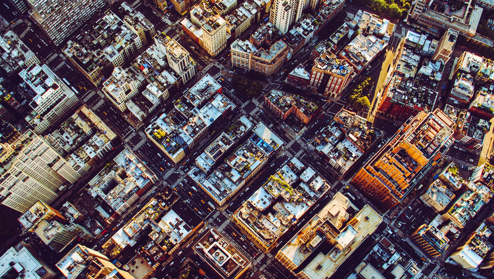
Image: Florian Wehde
For a small island just 13 miles long, the Big Apple holds centuries of history in its neighborhood names. Some were borrowed from Dutch or British settlers, others from police officers, urban planners, or real estate promoters, and a few were coined by architects armed with a map and imagination. Each name tells a story of how the city grew, block by block. Here’s a lively stroll through 12 of Manhattan’s most famous neighborhoods and the stories of how their names first came to life.
1
Hell’s Kitchen
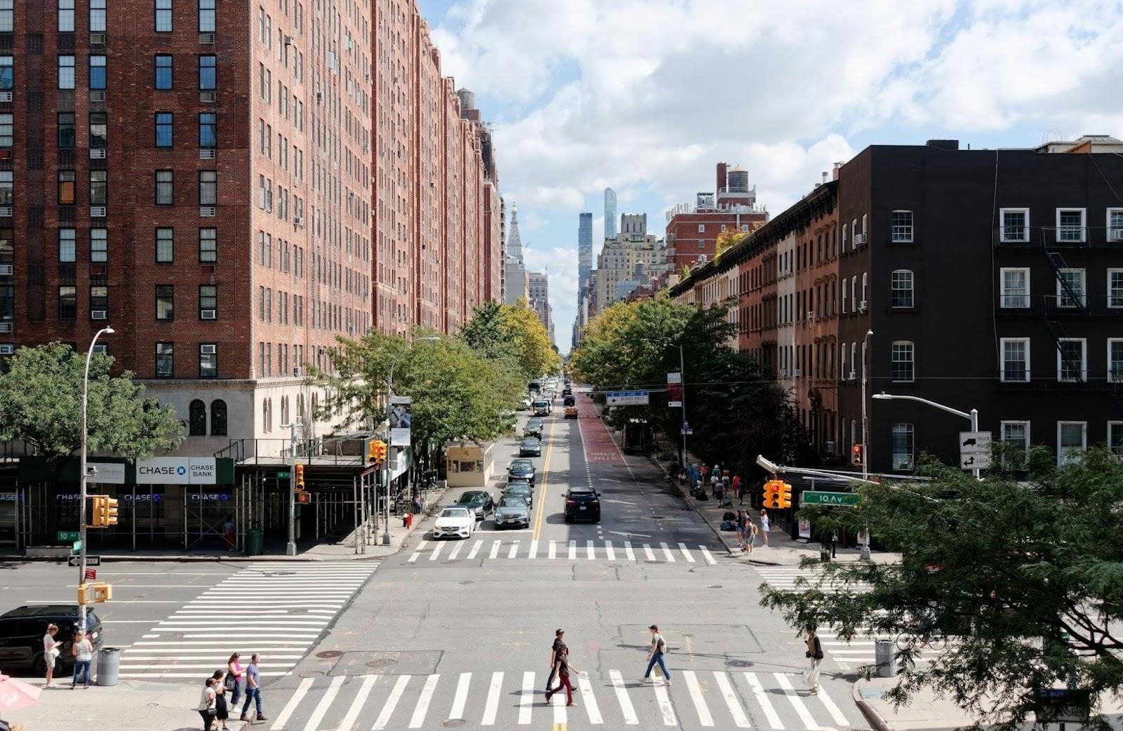
Image: Michael Matloka
What’s in a name? In this case, fire, grit, and a wink of humor. Legend has it that during a riot, a young police officer muttered, "This place is hell itself," only for his older partner to quip, "Hell’s a mild climate—this is hell’s kitchen." The pun was too good to forget, and the nickname stuck. Years later, developers tried a new label—"Clinton"—hoping it would sound more welcoming on real estate brochures. But New Yorkers can be a bit stubborn, and locals chose to keep the old name. After all, only "Hell’s Kitchen" could do justice to a neighborhood with that much flavor, grit, and, well, heat.
2
Harlem
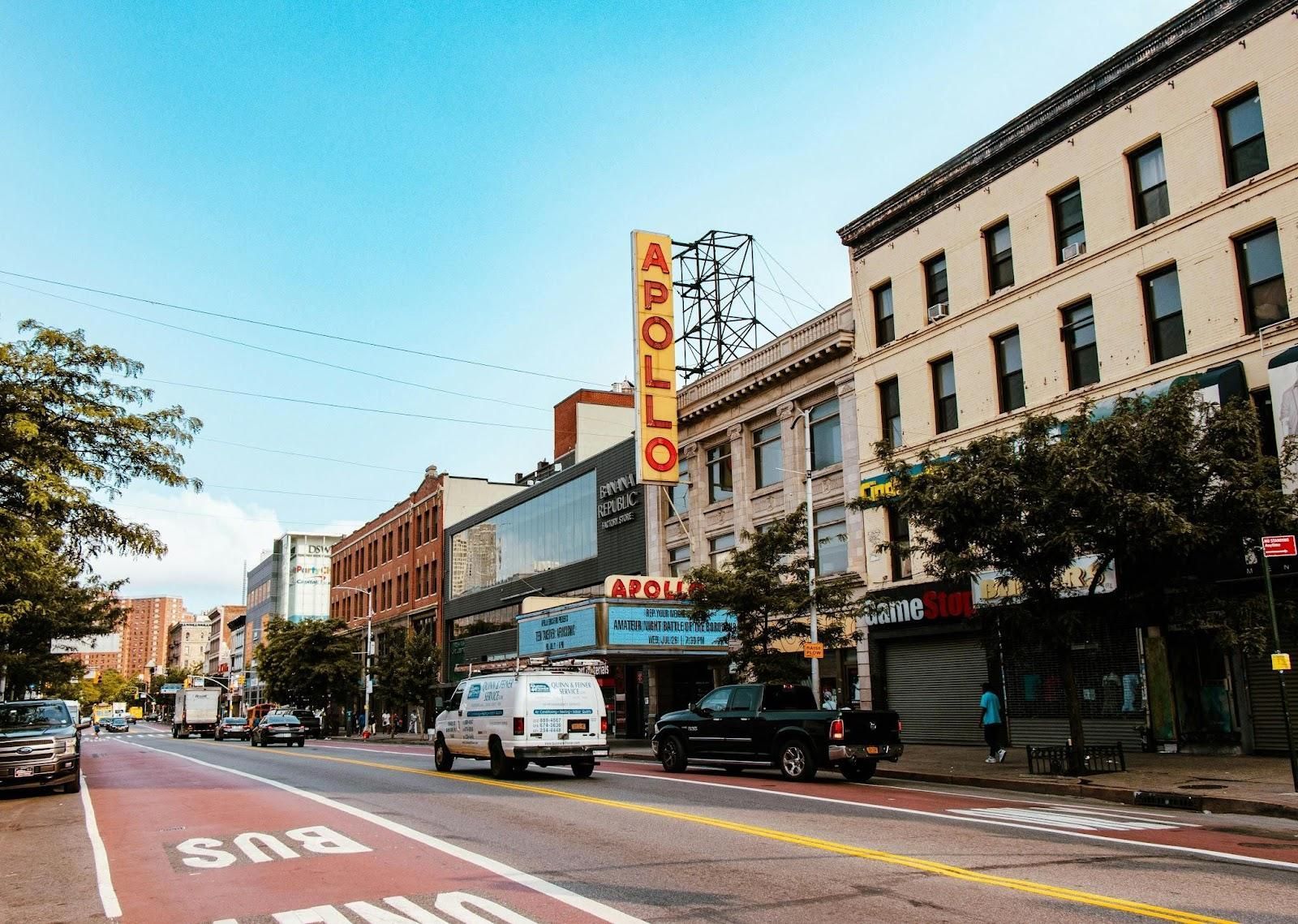
Image: Phil Evenden
Back in the 1600s, when northern Manhattan was little more than farmland, Dutch settlers, homesick for their town across the sea, named the area Nieuw Haarlem after Haarlem in the Netherlands. Time smoothed away the "Nieuw," but the name remained. Centuries later, Harlem became something entirely of its own: a world capital of music, art, and pride. The rhythms may have changed from Dutch hymns to jazz and soul, but the name still carries the same echo of nostalgia and creativity.
3
Greenwich Village
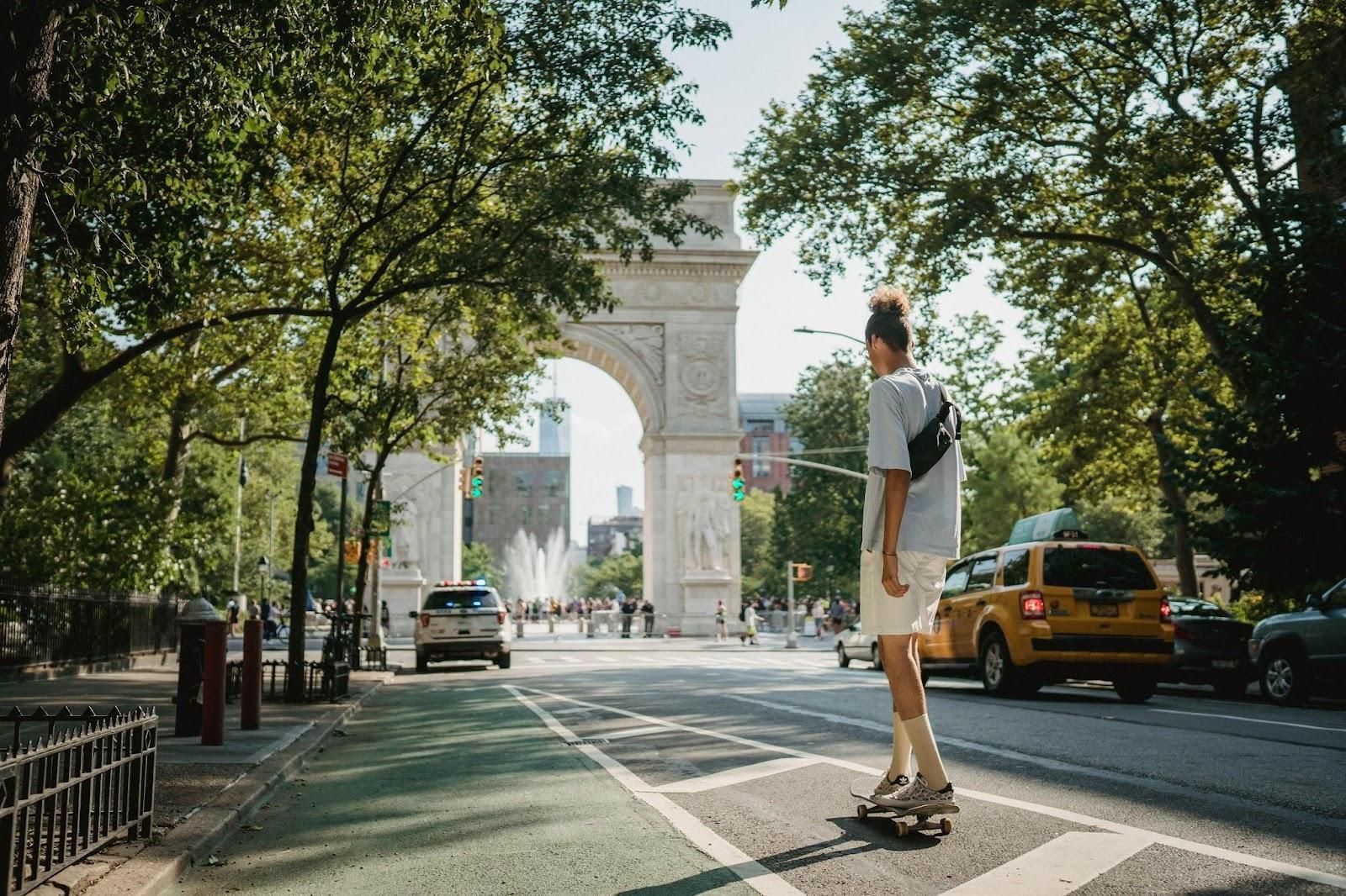
Image: Budgeron Bach
Long before jazz bars and coffeehouses filled the air with chatter, this corner of Manhattan was a quiet patch of countryside known as Groenwijck—Dutch for "pine district." The British, with their habit for renaming, turned it into Greenwich, and generations of locals affectionately shortened it to "the Village." Its winding lanes still ignore the city’s rigid grid, twisting and bending like memories of the farmland that came before. Even today, as musicians play on stoops and artists linger in cafés, the Village keeps that timeless feeling.
4
Chelsea
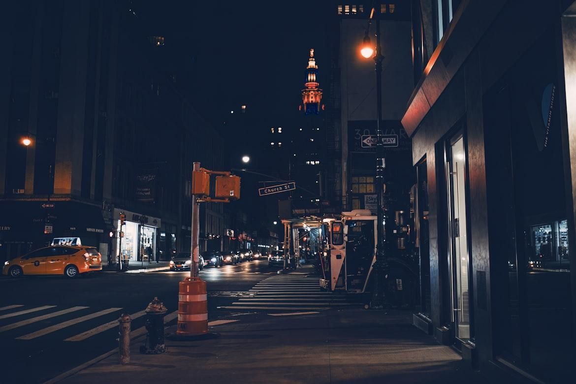
Image: Elric Pxl
Here’s a name steeped in nostalgia and old-world charm. In the mid-1700s, retired British Major Thomas Clarke bought a large plot of land overlooking the Hudson River and built his dream home, naming it "Chelsea" after the genteel London district he once knew. The estate is long gone, swallowed by the city’s constant growth, but its name never left the map. Over the centuries, the neighborhood evolved with a flair worthy of its heritage. First a quiet residential area, then a bustling creative hub filled with galleries, theaters, and fashion studios. Much like its London namesake, New York’s Chelsea has always worn its artistic spirit proudly, with just the right touch of elegance.
5
The Meatpacking District
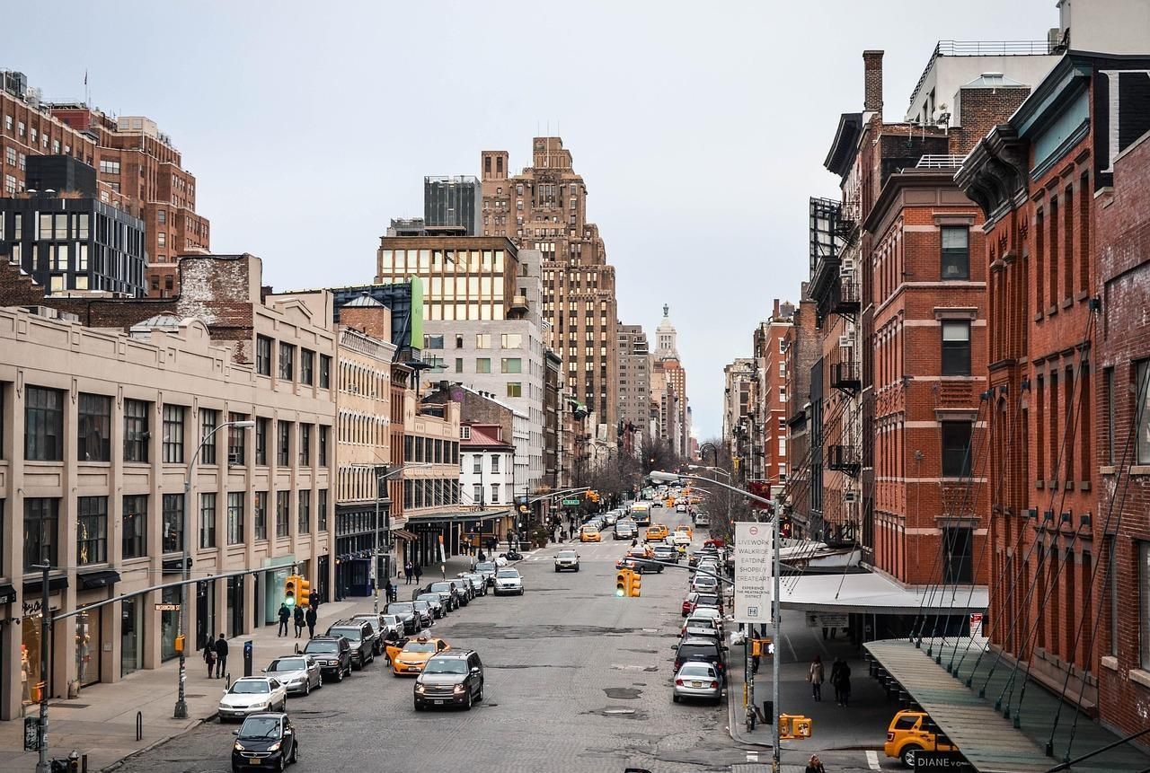
Image: TanjaSchwarz
It sounds tough because it was. In the early 1900s, this corner of Manhattan had more than 250 meatpacking plants and slaughterhouses filling the air with noise—and, yes, a certain aroma that no candle could ever mask. Workers hauled sides of beef down cobblestone streets dusted with ice and sawdust, a daily ballet of grit and muscle. Today, the scent of raw steak has been replaced by perfume and espresso, and the warehouses now house boutiques and rooftop bars. Still, the name "Meatpacking District" hangs on proudly, a reminder that even glamour was built on hard work and heavy lifting.
6
Times Square
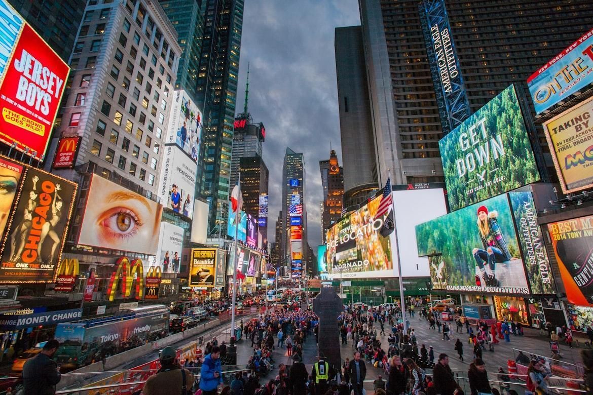
Image: James Ting
Believe it or not, the origin of this glowing crossroads has more to do with ink and paper than neon lights. In 1904, when The New York Times moved its headquarters to what was then called Longacre Square, the city decided to rename the area in the paper’s honor. To mark the occasion, the Times threw a grand celebration complete with fireworks and electric lights. Decades later, the newspaper has long since moved out, but the glow never dimmed. What began as a nod to journalism became the city’s biggest stage, where the lights still flash like headlines that never stop breaking.
7
SoHo
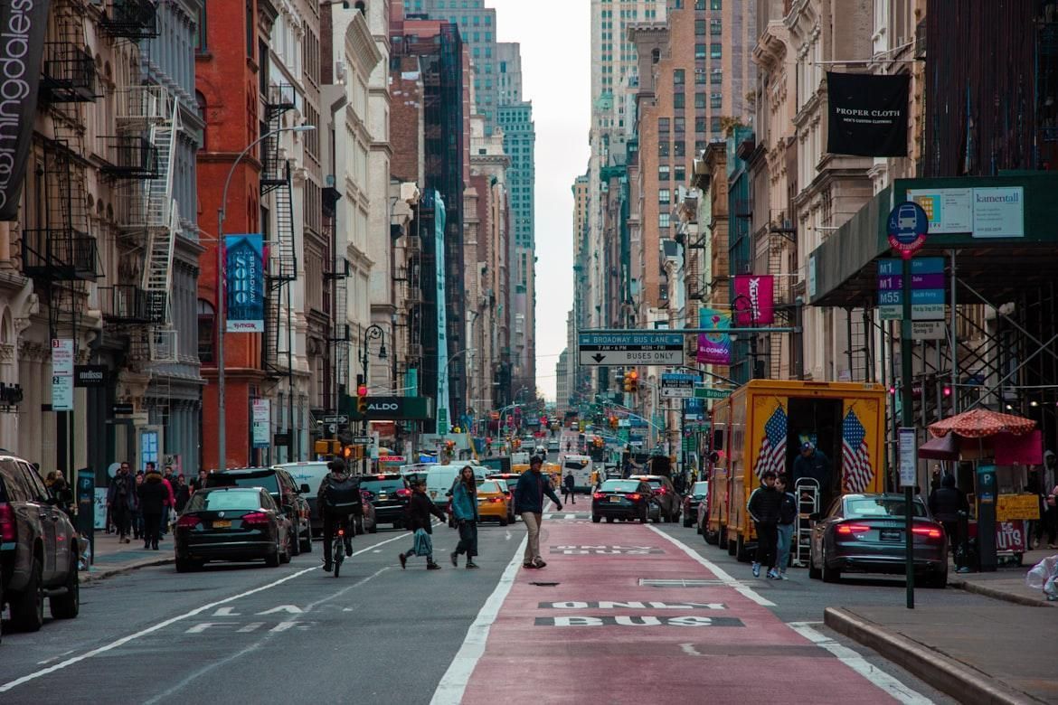
Image: Zeke Goodyear
It may sound like a borrowed bit of London, but this SoHo is a New York creation. Back in the 1960s, urban planner Chester Rapkin was writing a report about a fading industrial zone just SOuth of HOuston Street, and casually shortened that phrase into "SoHo." He couldn’t have known he was naming one of the city’s trendiest neighborhoods. As artists began filling the old cast-iron factories with studios and galleries, the nickname spread faster than wet paint. Soon, SoHo meant loft living, street art, and downtown cool. And here’s a fun fact for visitors: in Manhattan, Houston is pronounced HOW -ston, not like the Texas city. Mispronounce it, and you’ll hear all about it before you hit the next crosswalk!
8
NoHo
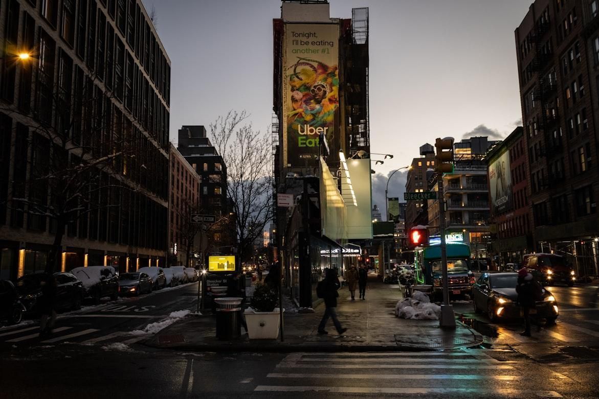
Image: Dylan Dehnert
By now, you probably know the drill. After the renaming of SoHo proved such a success, the north couldn’t be left behind. When the area NOrth of HOuston Street, another cluster of lofts and studios began to bloom, it soon earned the mirrored name "NoHo." Smaller and quieter, it kept its creative streak without the chaos. Cast-iron buildings, cobbled streets, and a calm charm that feels like SoHo’s thoughtful twin, equally artistic but happy to hum instead of shout.
9
TriBeCa
Image: Essow K
What if geometry had a ZIP code? That’s pretty much how TRIangle BElow CAnal Street —better known as TriBeCa—came to be. The name began as a bit of city-planning jargon for a small, oddly shaped area, but once The New York Times printed it, the label spread faster than a rumor on the subway. Before long, the whole neighborhood embraced its new identity. Today, those wide streets and grand old warehouses host film festivals, art galleries, and lofts so sleek they make geometry look downright glamorous.
10
NoLIta
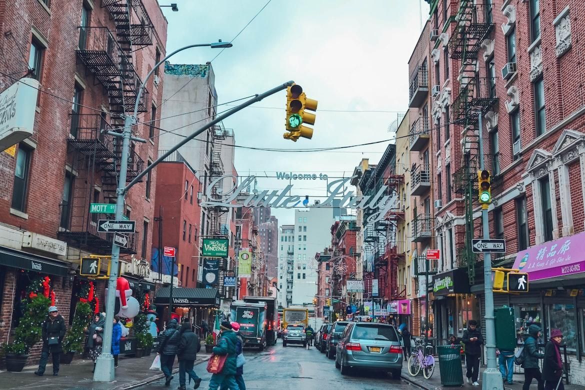
Image: Alex Haney
Tucked just NOrth of LITtle ITAly, this petite pocket of Manhattan once blended seamlessly with its pasta-and-pastry-filled neighbor. Then came the wave of stylish boutiques, corner cafés, and street-front charm that begged for its own identity. The solution? NoLIta, a name so snappy it sounds like it’s been around forever. Sleek, sunny, and effortlessly cool, it’s proof that in New York, a clever name can turn a few city blocks into a full-blown destination.
11
Turtle Bay
Image: Masahiro Naruse
At first glance, the name sounds cute enough for a storybook, and in a way, it is. Back in the 1600s, Dutch settlers named a small farm near a creek that flowed into the East River. Some say it referred to the turtles that lived there; others claim it came from the Dutch word deutal , "bent blade," describing the curve of the bay. Either way, it’s one of Manhattan’s softest names, a calm corner in the city that never sleeps.
12
Gramercy
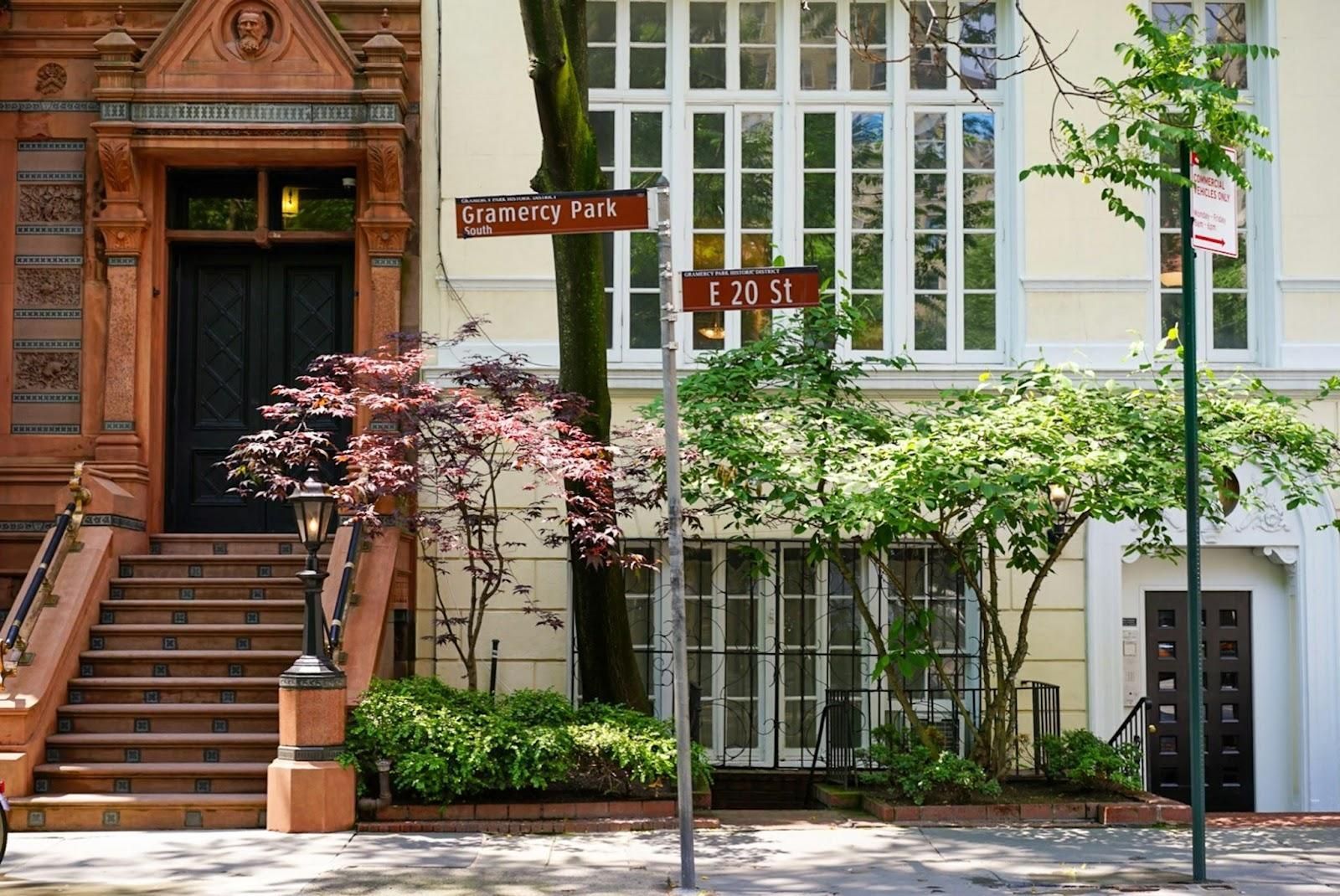
Image: Megan Bucknall
Long ago, this Manhattan neighborhood was a swampy patch of land the Dutch called Krom Moerasje , meaning "little crooked marsh," hardly the kind of description you’d want on a real estate brochure. In the early 19th century, developer Samuel B. Ruggles acquired the land and renamed it Gramercy , adapting an archaic expression derived from the French grand merci , meaning "many thanks." Suddenly, it sounded far more elegant. The neighborhood grew around its most famous feature: Gramercy Park, a private, gated square that remains key-only to this day. In New York, that’s about as close as it gets to a secret garden.